A lush visual celebration of Pulp's sixth album, This Is Hardcore, featuring unseen photography, behind-the-scenes interviews and revealing visuals. From the mid- to late 1990s, Paul Burgess was invited by Jarvis Cocker to document the British band Pulp, taking photographs during video shoots, live gigs and other events for what has become one of the landmark albums of the period, This Is Hardcore. Written and designed by Burgess and Louise Colbourne, Hardcore contains a candid selection of previously unseen images of the band, behind the scenes and on set, of the four main video shoots made to promote the album. Twenty-five years have passed since Pulp released this extraordinary album, and this book holds up a mirror to the ingenious creative processes and characters behind the seminal record. With carefully curated images from Burgess's archive, Hardcore also includes quotations and interviews from then and now by the video directors, band members and other artists involved with the album. The book contains contributions from Doug Nichol, John Currin, Stephen Mallinder, Sergei Sviatchenko, John Stezaker and Florian Habicht, all of whom have a connection to the album, the band or the era. There are also visual responses from a selection of younger artists and designers, such as Alexa Vieira, who have been inspired by Burgess's photographs and the band's legacy.
Tony Seddon Reihenfolge der Bücher (Chronologisch)


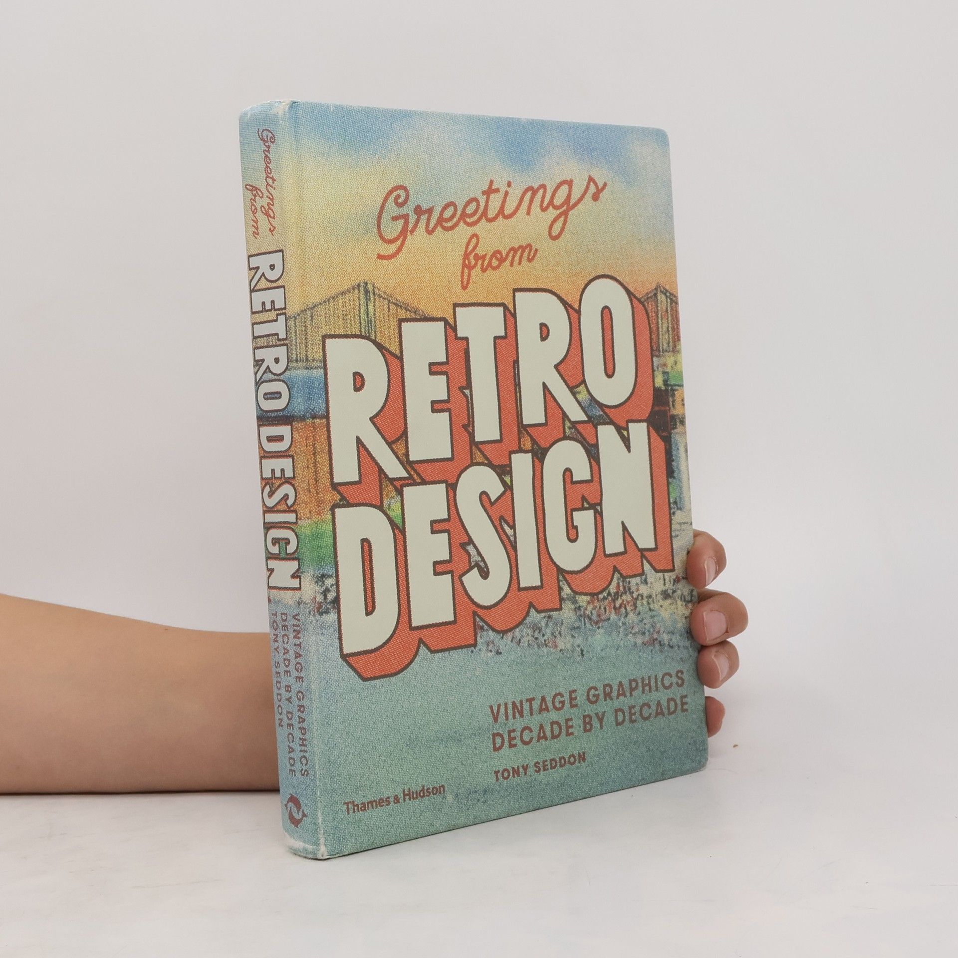
Greetings from Retro Design
- 224 Seiten
- 8 Lesestunden
What is a true 1950s look, as opposed to a 1930s or 1940s look? This book aims to address that question by thoroughly surveying the development of graphic design over the course of the 20th century. Timelines for each decade highlight key moments, styles and movements, while profiles of thirty influential graphic designers three per decade are interspersed throughout the book.
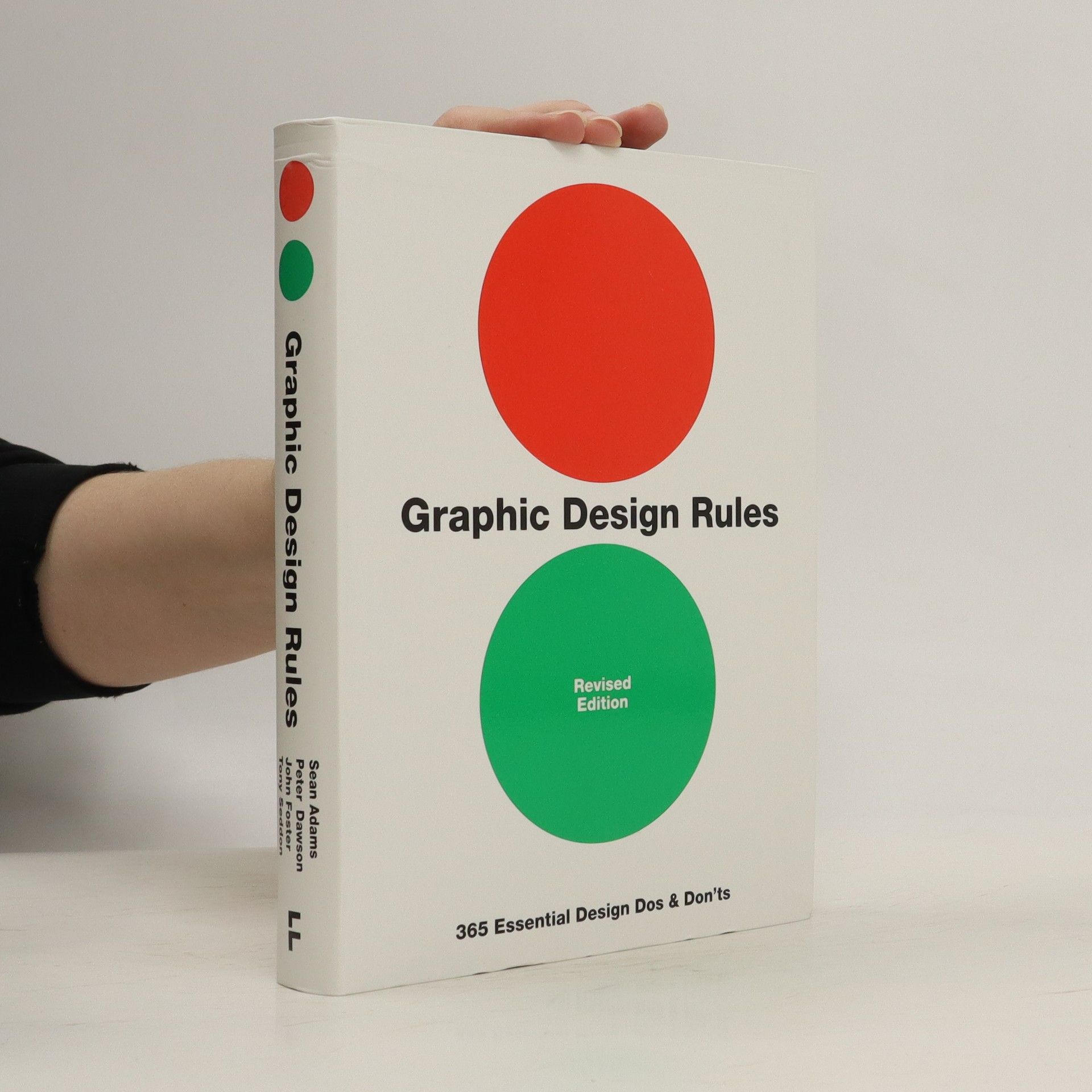
Graphic Design Rules
- 383 Seiten
- 14 Lesestunden
365 daily design mantras from four leading industry experts, providing you with valuable design dos and don'ts for every day of year. Packed with practical advice presented in a fun, lighthearted fashion, this is the perfect book for the ever-growing group of non-designers who want some graphic design guidance. And for more experienced designers, individual entries will either bring forth knowing nods of agreement or hoots of derision, depending on whether or not the reader loves or hates hyphenation, has a pathological fear of beige, or thinks that baseline grids are boring. In the style of a classical almanac, 365 entries combine a specific rule with a commentary from a variety of experienced designers from all fields of the graphic design industry. Covering topics such as typography, colour, layout, imagery, production, and creative thinking, you can either dip in at random or use the book as the source of a daily lesson in how to produce great graphic design.
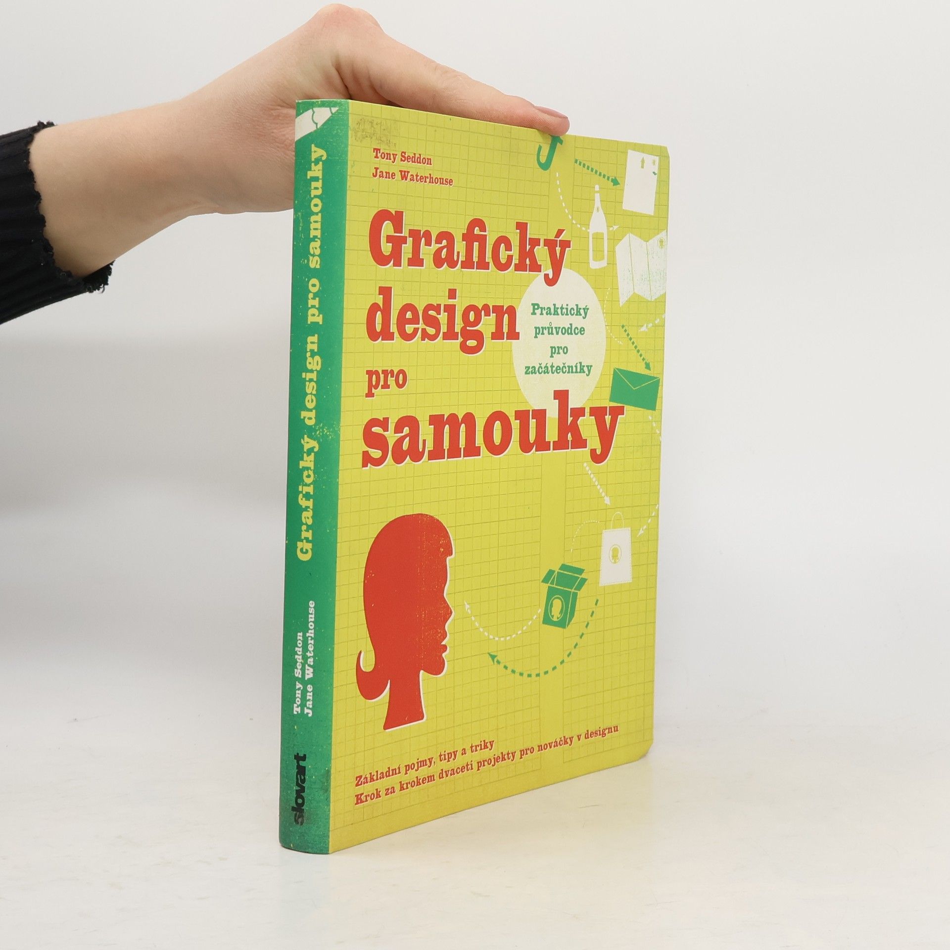
Grafický design pro samouky
- 224 Seiten
- 8 Lesestunden
Každý z nás aspoň jednou v životě vytvářel nějaký dokument, který lze zařadit do kategorie "grafický desing". Ať už se jednalo o pozvánku na oslavu narozenin, plakát nebo jen inzerát na firemní či školní nástěnku nebo web, můžeme jej příště udělat s pomocí této knihy profesionálně dokonalým. Grafický design pro samouky vysvětluje základní principy grafického designu včetně efektivního využití prostoru, barev a písma. Publikace transformuje obtížně získané zkušenosti profesionálních designérů do jednoduchých pravidel, co a jak používat a čeho se naopak vyvarovat, ilustrovaných tipů a rad doplněných srovnávacími příklady. Kniha nezapomíná ani na potřebné vybavení a jeho cenu, popisuje nejlepší a cenově nejdostupnější materiály, hardware a software.
Art Directing Projects for Print
Solutions and Strategies for Creative Success
- 256 Seiten
- 9 Lesestunden
Art directors need to balance both the creative and business-oriented aspects of their role to be truly successful. As well as needing top-level visual and creative skills, art directors must also motivate, communicate with, and inspire their coworkers and clients. Art Directing Projects for Print provides a creative, inspirational, and “skill set” path for designers who wish to raise their careers to a more ambitious level. This ground-breaking book will give them the essential building blocks to make the professional transition from competent designer to pace-setting art director, in the highly competitive and innovative area of print design. Art Directing Projects for Print reveals the professional skills involved in key creative areas of print design through providing a unique mix of theory, context, contemporary media awareness, inspirational case studies, international showcases, interviews with big-name professionals, developmental advice, and practical information.
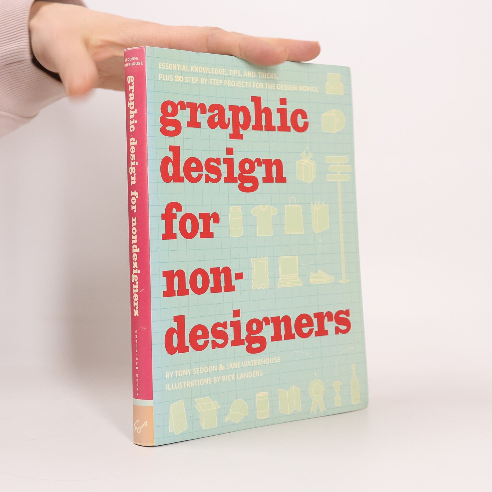
Graphic Design for Nondesigners
- 224 Seiten
- 8 Lesestunden
Not a graphic designer? Not a problem! Whether the project's a birthday card, a poster, or a flier, Graphic Design for Nondesigners is here to help. Twenty step-by-step projects for designing everything from Web sites to business cards to T-shirts are accompanied by a clear and concise initiation into the basic principles of graphic design€”including the effective use of space, color, and type€”presented in a way that's easy for anyone to start applying right away. Armed with this essential primer, nondesigners will have everything they need to go forth and create effective design with polish, panache, and grace.
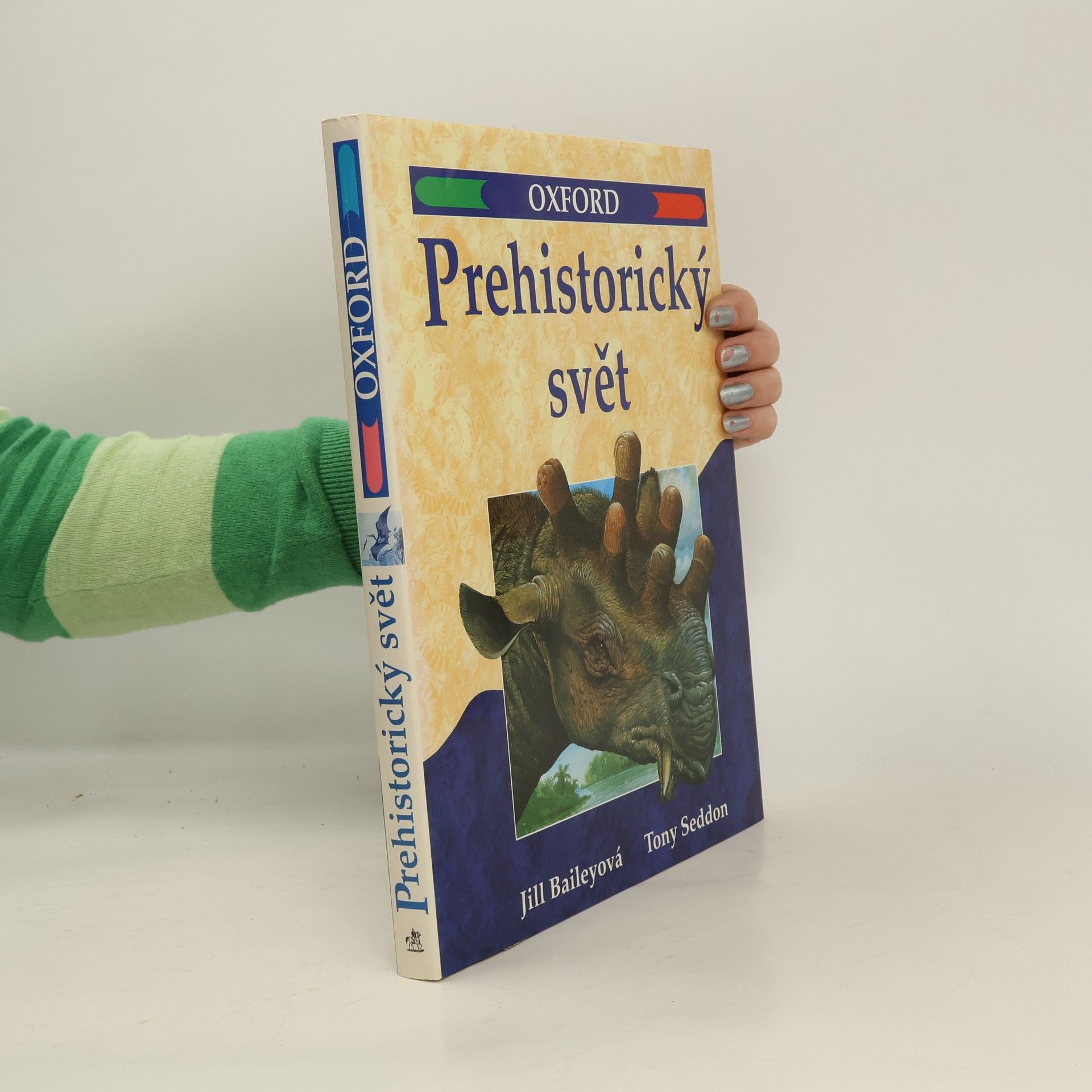
Prehistorický svět
- 160 Seiten
- 6 Lesestunden
Tentokrát nejen o dinosaurech, ale také o trilobitech, loděnkách, žralocích, pelykosaurech, ichthyosaurech a srstnatých mamutech... Školní oxfordská encyklopedie Prehistorický svět vás spolu s vynikajícím obrazovým materiálem seznámí s celistvou historií života na Zemi od jeho prvopočátků až po příchod lidstva.
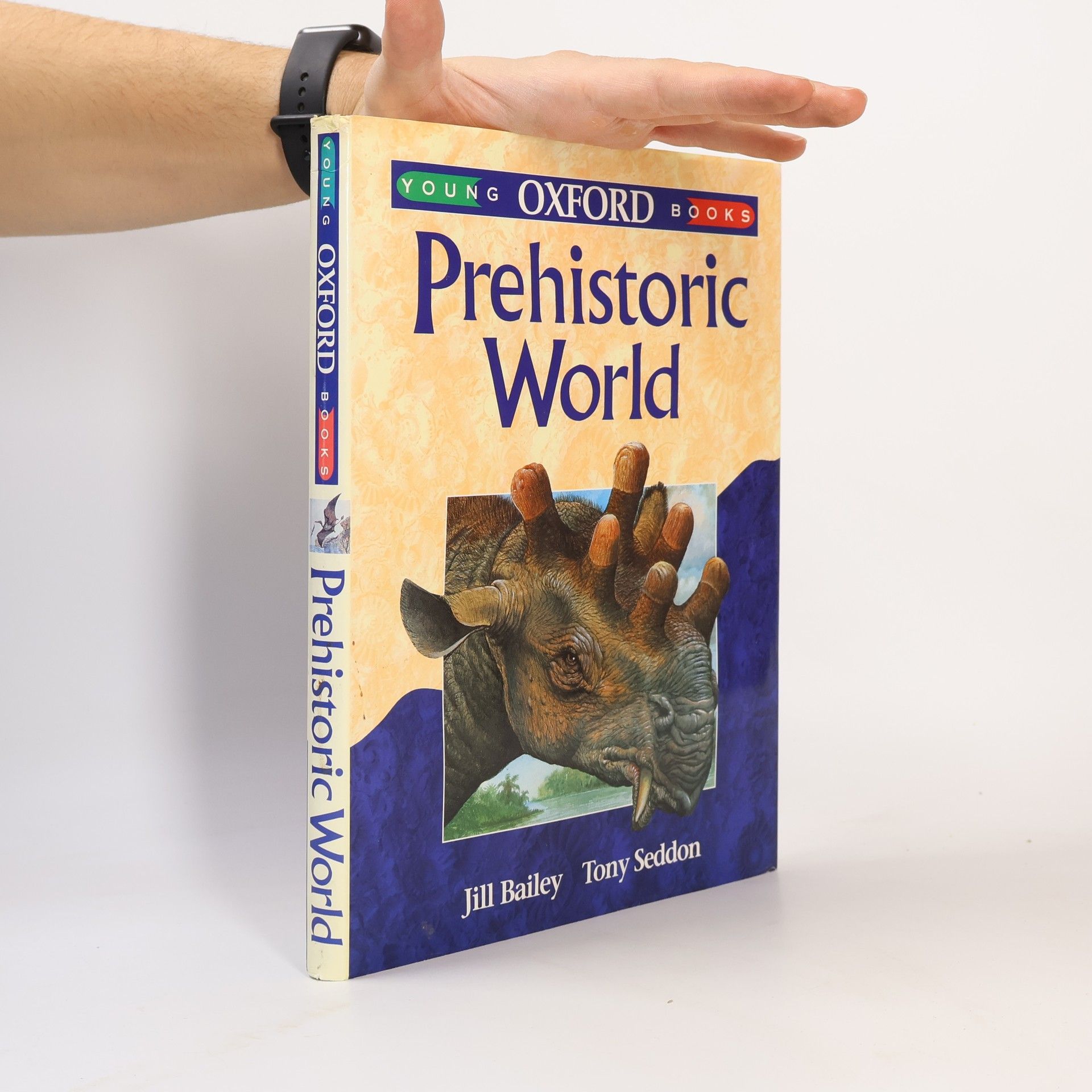
Young Oxford Books: Prehistoric World
- 160 Seiten
- 6 Lesestunden
This is the complete story of the prehistoric world, which takes the young reader from the origins of the universe, through the beginning of life on Earth, to the arrival of homo sapiens. The text is structured as a chronological narrative with a chapter for each of the geological epochs. Geological and fossil evidence is examined throughout and used to support the various theories discussed. Evolution is clearly shown as a continuing process, with the evolution of horses and elephants treated in a series of updated reports throughout the book. The story of human evolution has a separate chapter.
