
Dieser Atlas vereint neuartige digitale thematische Kartographie mit prägnanten Wirtschaftsanalysen. Rund 400 Themen aus allen Lebensbereichen vermitteln eine völlig neue Sicht auf die Welt.
Daniel Dorling Bücher
Danny Dorling ist ein britischer Sozialgeograf, dessen Werk sich mit den Komplexitäten von Ungleichheit und Humangeographie befasst. Seine Forschung setzt sich mit wichtigen Fragen in Bezug auf Wohnen, Gesundheit, Beschäftigung, Bildung und Armut auseinander. Dorling bemüht sich, ein tiefgreifendes Verständnis sozialer Ungleichheiten durch zugängliche Publikationen zu vermitteln. Sein Ansatz, beeinflusst vom Ethos, dass Spielen Lernen fürs Leben ist, betont visuell ansprechende und verständliche Darstellungen von Daten und gesellschaftlichen Herausforderungen.


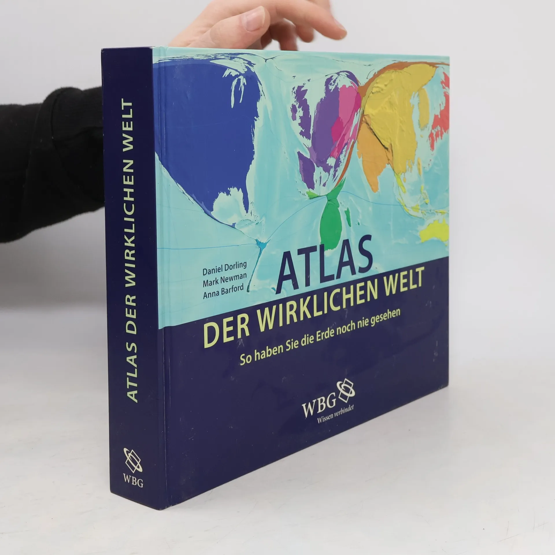
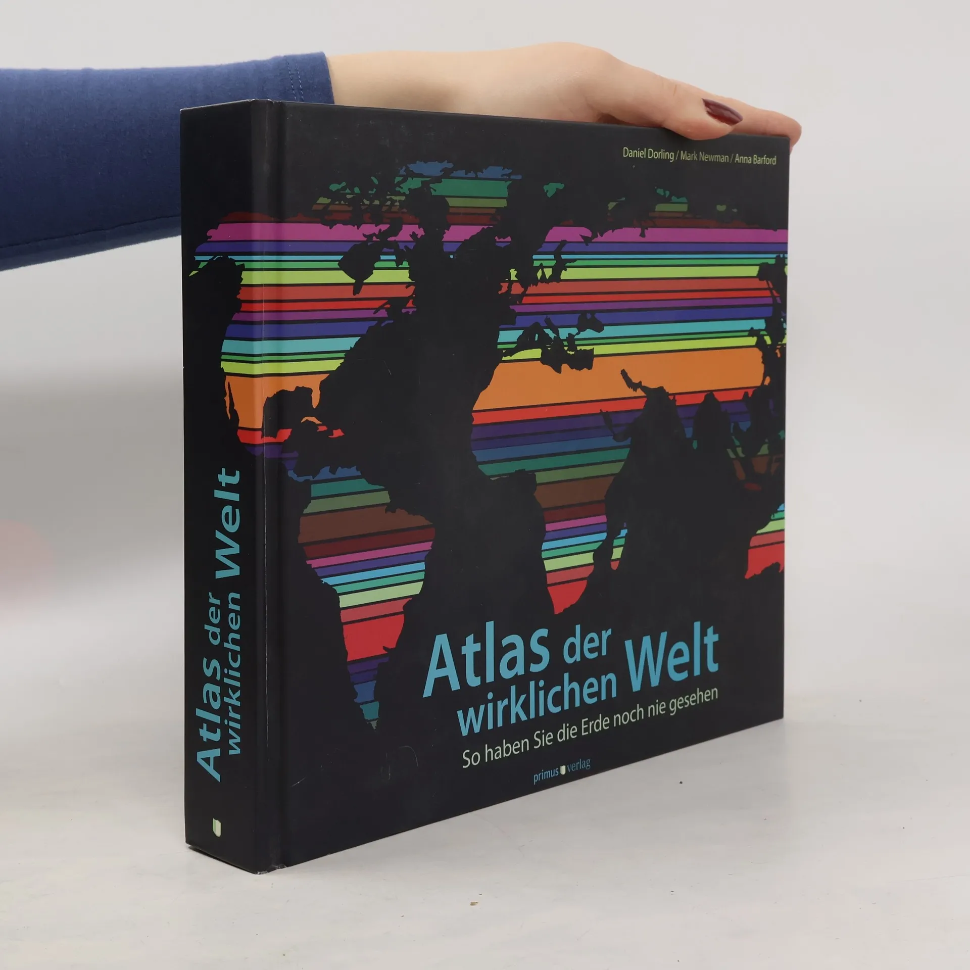
Atlas der wirklichen Welt
- 416 Seiten
- 15 Lesestunden
Dieser Atlas zeigt Ihnen die Welt, wie Sie sie noch nie gesehen haben. Das Buch kombiniert die Ergebnisse neuester digitaler Kartographiemöglichkeiten mit prägnanten Analysen der in den Karten dargestellten Sachverhalte. Öffnen Sie den Atlas an beliebiger Stelle, und Sie werden garantiert etwas über unsere Welt erfahren, das Sie noch nicht wussten
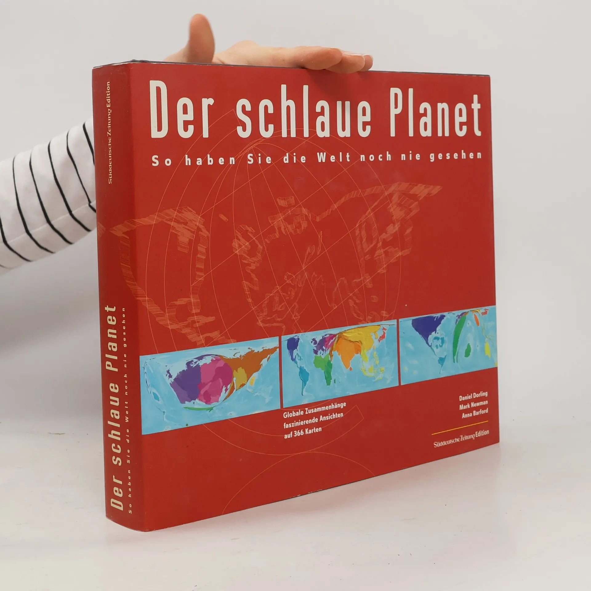
Der schlaue Planet
- 400 Seiten
- 14 Lesestunden
Welches Land ist groß im Wasserverbrauch? Welches klein in der Umweltverschmutzung? Ist Deutschland gemessen an seinen Mobiltelefonen so groß wie Angola? Fläche und Ausdehnung eines Landes sagen nichts über seine Bedeutung in der Welt aus. Wie verschieben sich die Größenverhältnisse, wenn wir statt nach Quadratmetern, nach der Stromversorgung, der Automobilproduktion oder dem Export von Spielzeug und Sportgeräten fragen? Die bekannten Größenverhältnisse verzerren sich und offenbaren das wahre Antlitz der heutigen Welt.
Rule Britannia
- 416 Seiten
- 15 Lesestunden
The authors argue that the vote to leave the EU was the last gasp of the old empire working its way out of the British psyche. Fueled by a misplaced nostalgia, the result was driven by a lack of knowledge of Britain's imperial history, by a profound anxiety about Britain's status today, and by a deeply unrealistic vision of the future.
Includes 366 digitally modified maps known as cartograms that depict the areas and countries of the world by their demographic importance on a range of topics, ranging from basic data on population, health, wealth and occupation to how many toys we import and who's eating their vegetables.